Only LINKEDIN BANNER guide you need! 💯
"If you never forget to optimize Bumble, then how can you forget to optimize LinkedIn?" 🤔
When someone visits your profile, the first impression is shaped by your banner. If your banner is ordinary or boring, what’s the point of having an account? An extraordinary banner that speaks for you is MUST!!! 🙌🏻
As a LinkedIn PRO MAX, I’m here to help you create an effective banner that is both simple and eye-catching. In this document, I’ll address all the questions you might have, guiding you through the steps for a standout banner!
Steps to Create Your LinkedIn Banner
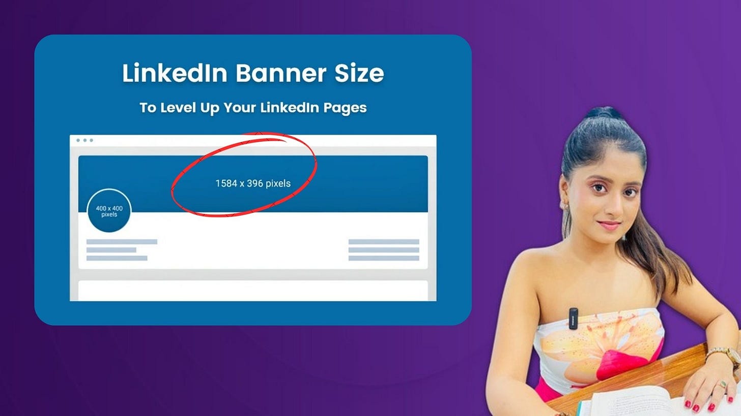
Choose the Right Dimensions
The ideal size for a LinkedIn banner is 1584 x 396 pixels. This size ensures that your banner will display perfectly across devices, both on desktop and mobile. If your banner is too small, it might appear blurry.Keep Your Branding in Place
Use colors, fonts, and imagery that aligns with your personal or company brand. If you have a logo or tagline, this is a great place to feature it. A banner is an extension of your brand, so consistency is key.
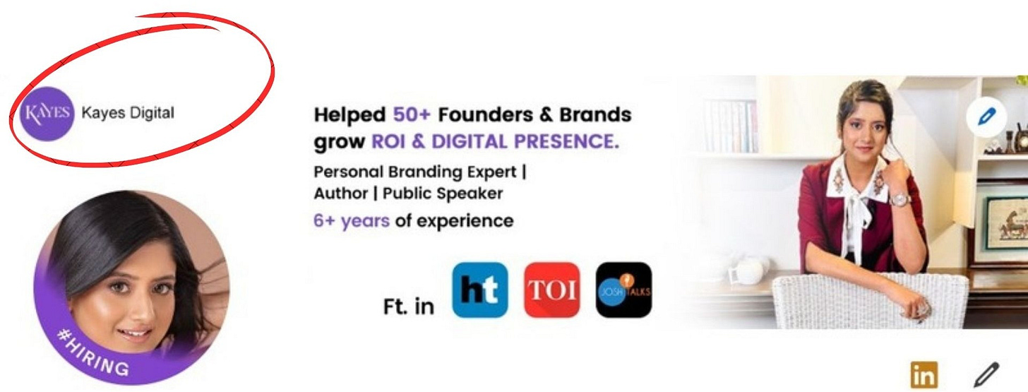
For example, in my LinkedIn banner, I selected my brand colors and included my logo. This way, anyone who visits my profile immediately knows I’m the founder of KAYES. It’s all about branding and making a memorable first impression!
Add a Clear Message
Your banner should tell visitors something about you. This could be your job title, the services you offer/ your credibility/ your expertise or a quote that represents your outlook. Just make sure it’s short, readable, and relevant.
For example, in my banner, I’ve clearly stated in the middle what I’ve achieved, what I do, and the services I offer. This helps convey my message to anyone visiting my profile for the first time, especially those who may only have 30 seconds to spare. It’s all about making that quick connection!
Use High-Quality Images/ Visuals
A blurry or pixelated image can do more harm than good. Make sure to use high-resolution images that reflect professionalism. If you’re using an image of yourself or your business, ensure it’s clear and visually appealing.
For example, I chose my banner image very carefully. While my profile photo shows my face clearly, my banner features a full-body shot, which creates a stronger impact. Most importantly, I made sure to use a high-quality image that looks professional!
Test It Out
Once you’ve created your banner, upload it to LinkedIn and view it on different devices (desktop and mobile). Make sure no important information is cut off or hard to read. A quick check can save you from design mishaps!
BONUS BABY!
Since you've made it this far, here are a few more LinkedIn banner examples that can inspire you to create a standout design!
1. Logo banner
A logo banner for LinkedIn is a template designed with a specific space to feature your logo.
2. Abstract
An abstract banner template for LinkedIn uses modern design, with geometric shapes, lines, and abstract elements to create a fresh, professional look.
3. Illustrations-based banners
4. Photo banner
A photo banner for LinkedIn is a template designed with a dedicated spot for a key photograph. It allows you to showcase one or multiple photos that represent your industry, making your profile visually engaging.
Having helped over 150 brands in 7 countries over the past 5 years, here are some of the milestones I’ve created for multiple businesses & founders 👇
➡️ Check my Portfolio: https://drive.google.com/file/d/1jqSURS3GbpiHxxjW8H8v5HfEROrQdbqB/view?usp=sharing
To know more about what I do & in case you wanna get in touch:
➡️ LinkedIn: https://www.linkedin.com/in/karishmaasinghalmarketing/
➡️ Instagram: https://www.instagram.com/kayes.digital/
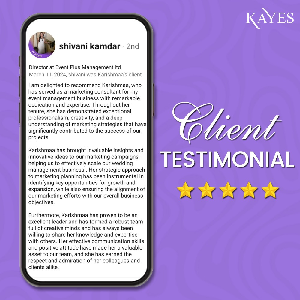
Don’t trust what I tell you, Hear it from my clients 👇


